WorkingHours version: Version 2.17.1
Operating system: macOS
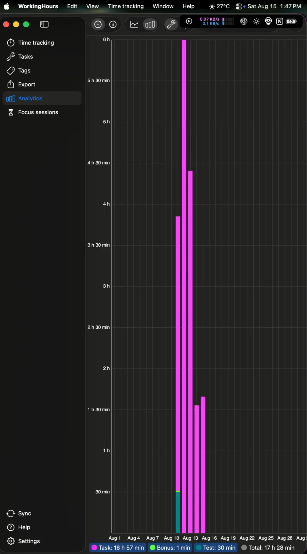
Device model: External monitor in portrait orientation
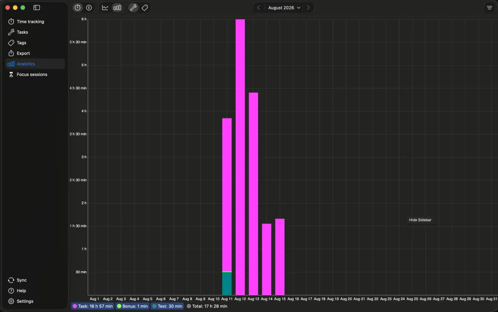
When I use WorkingHours on a normal landscape display, the Analytics bar chart has a balanced size and the bars are easy to compare.
On a portrait-oriented monitor, however, the chart expands to use almost the entire vertical height of the screen. This makes the bars very tall and thin, and I find the chart harder to read at a glance.
Could the Analytics chart keep a more practical maximum height or aspect ratio when the app window is very tall? The normal landscape layout shown in the attached screenshot is much easier to read.
I have attached screenshots showing both the normal layout and the portrait-display layout.