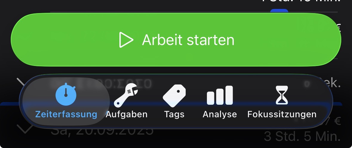
The floating bottom navbar loses some horizontal space because Apple decided this is good "design". WorkingHours displays 5 items. Depending in the language of the app the text below the icons takes up a lot of space. German for example. As a result everything looks cramped. 
I suggest an option to hide some of the navbar items behind a three-dots-menu on position 4 of the navbar (outer right). Ideally the navbar should not contain more than 3-4 buttons. For example I rarely edit tags. I do not need the option on level 1 of the app. I also rarely use focus sessions. Other people sure do. It would be nice to customise the navbar items according to personal usage pattern.
WorkingHours version: 2.13.5
OS + version: iOS 26.0
Device model: iPhone 15 Pro